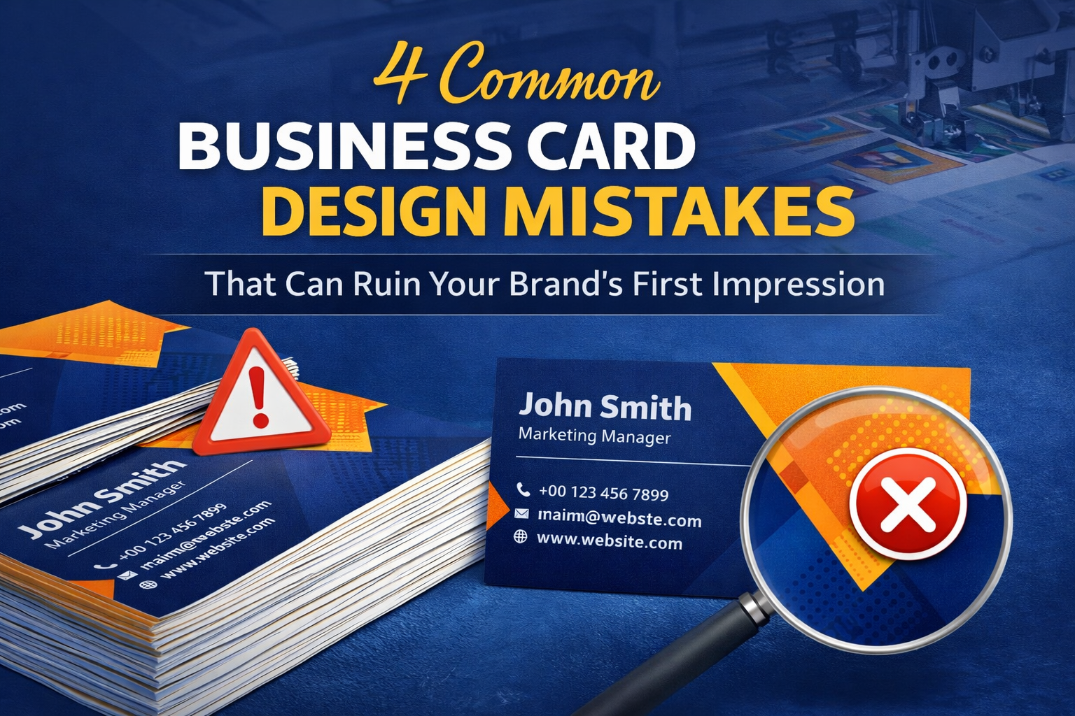
4 Common Business Card Design Mistakes That Can Ruin Your Brand’s First Impression
You’ve heard that it’s all about “the first impression,” but in business, what really makes the difference? You guessed it: your calling business card. If you are a business owner, this means that the quality of your card is also the hallmark of the way you run your business.
But as DIY design software (looking at you, Canva) has exploded in popularity, we’ve witnessed an explosion of bad designs resulting in bad printing jobs. If a card isn’t intentionally designed to respect printing particulars, it will look dreadful at all.
We have decades of experience at Printing Press Technology and here are 4 major mistakes you should prevent.
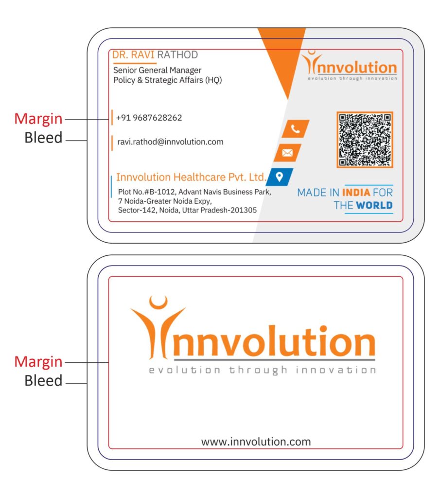
Mistake 1: Ignoring Margins (The “Safety Zone”)
Margins matter a lot, but they are also the most neglected aspect of business card design.
Regardless of which software you favors, there’s an important rule for it and all others: You must keep text, parts of the image, or any other key element away from the cutting edge. Otherwise if your card is cut after printing, the chances are very high that your text or logo will be cut off.
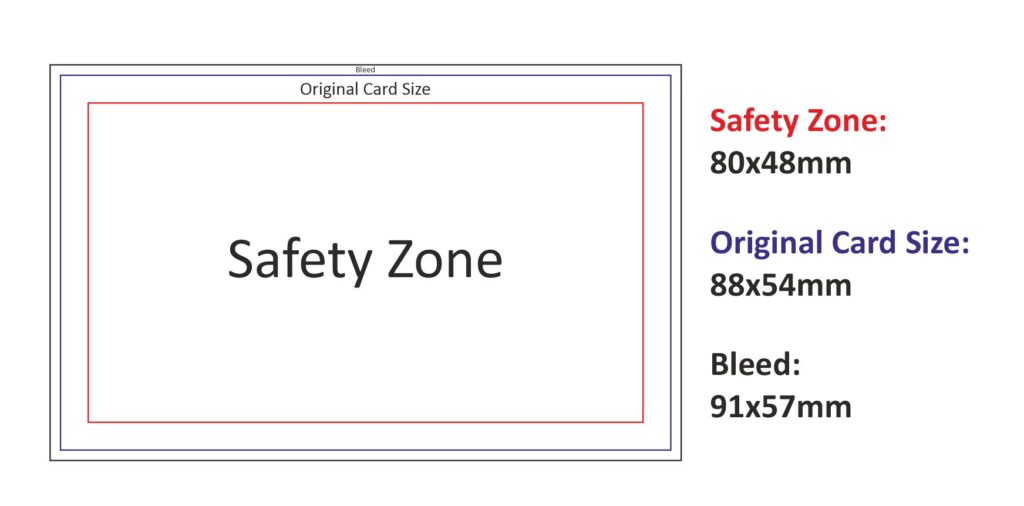
Recommended setup (standard card):
- Card size: 88 × 54 mm
- Safe content area: 80 × 48 mm
- Please make sure all essential text is placed within the safe area.
- Design elements like circles, backgrounds, lines, and more. can go away from the edge.
- Add 3 mm bleed to the final size is 91 × 57 mm including bleed.
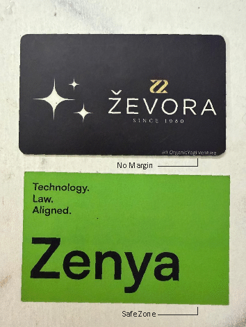
Designers sometimes keep asymmetrical margins for aesthetic reasons, and that’s fine, but any critical content should stay inside the safe print zone.
👉 Keep it inside, if it’s necessary.
Mistake 2: Designing with RGB vs. CMYK
If you are designing a card for digital sharing, RGB (Red, Green, Yellow) is what you can use. But if you’re printing it, your design should be in CMYK (Cyan, Magenta, Yellow, Black).
Why?
Since most professional printers operate in the CMYK mode. RGB colors have a tendency to look so bright and shiny on our screens, but when printed the colors automatically transform from RGB to CMYK, and they will appear dull or a totally different color.
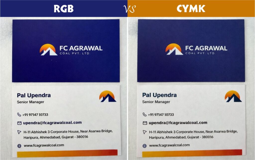
This is one of the most common reasons for customer dissatisfaction based on real printing experience. Designers design in RGB, on their monitor they approve how it looks then ask the printer why it doesn’t match.
Simple rule:
- RGB for screen.
- CMYK for print.
Mistake 3: Forgetting the “Bleed”
If you’re designing with background elements, borders, or items right up to the edge, bleed is compulsory.
Business cards are printed on large sheet sizes like 12×18in or 13×19in. Up to 25 cards are put on one sheet. The only place for superfine movement is when the spring stack is cut to final size. Without the bleed, this can cause white lines that you don’t want. This is why bleed is compulsory in element based design.
You might be thinking, what if I have a very simple design and it doesn’t touch the edges?
In that instance, the danger is less. But of course, adding bleed is the safe professional thing to do.
- Heavy on the quantity of elements = mandatory bleed
- Basic design = not required but a good idea
Use of JPG/PNG and not Vectors
Many use Canva to design and export as a JPG or PNG. Sure, those look good on social media, but they are “Raster” files that are made up of pixels. These pixels, when printed out, they can appear blurry and have a “jaggy” appearance.
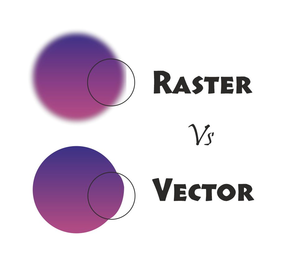
The Canva Trap: You probably used canva to export a svg but they won’t import well into professional printing software such as CorelDraw or Adobe Illustrator.
The Best Practice: For the best printed card, create your design with Vector-based or If you use Canva, always export as “PDF Print” (High Quality & CYMK), not JPG. This is to retain the original quality and for the conversion not to shift towards a “bluish” direction.
Conclusion
A business card is a handshake in print. It is easy enough to avoid these four technical mistakes, Margins, CMYK colour, bleed, and file format, that will prevent your card from looking as professional in your hand as it did on the good old display. Don’t lose out on the print budget because of a small design mistake.
Looking for more expert printing tips and design hacks? Subscribe to our newsletter below!
Share this content:


Post Comment